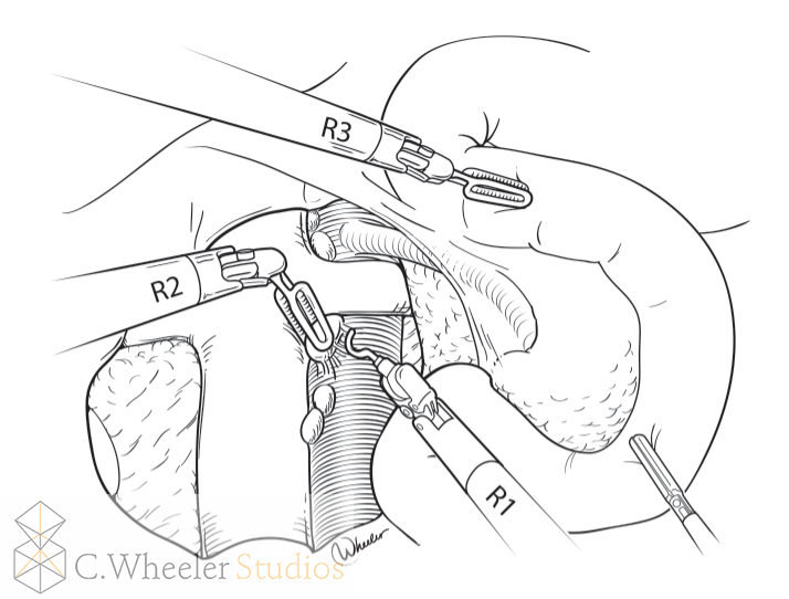
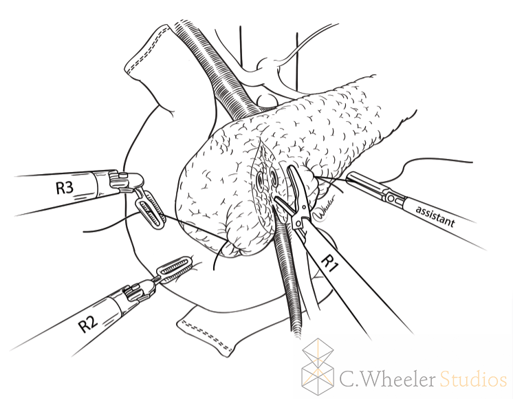
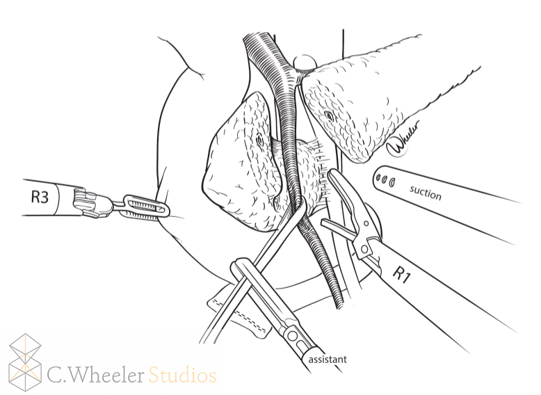
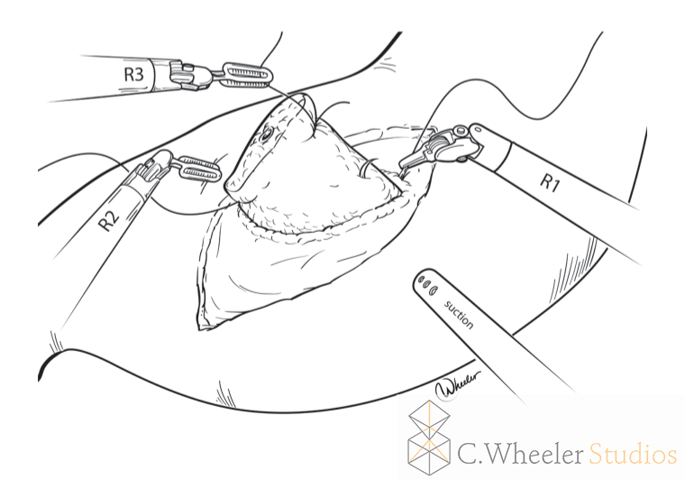
So, when a client first approaches me to work with them on a project, one of the first things I ask is, "What style would you like?" So, what do I mean when I ask this, and what are some of the options?
First off, style is something intrinsic to each illustrator. Even if an illustrator is a style chameleon, there are some motifs that they will use frequently (such as color scheme, certain shapes, or arrangements on the page). Some illustrators (medical and scientific illustrators included), have one set style that they use, they are known for, and they stick to it. This doesn't imply that they are any less facile in the use of other media or even other styles, it just is how they prefer to work and they find that it's their go-to solution for visual problem solving. The upside of this is that clients generally know what they're going to get (at least, in terms of aesthetics) before they even approach the illustrator.
On the other hand, some of us like to employ many different styles, fitting it to the look and feel of whatever the final product will be. I fall into this camp--I love being able to flex my creative muscles in different ways, and use different techniques that I have been honing over the years. This flexibility means that I can work with many different clients on many different projects, and I will optimize the style for the end use as well as the client's budget--yes, some styles cost less. The downside here is the flipside to the strength of the illustrator with a distinct style. Clients often ask me for a sample, just so they can be sure that they'll get what they really want. I totally understand! Hiring a new illustrator for a project is potentially embarking on a long journey, and it's an investment of time, money, and energy. You want to be sure that you'll be happy with the outcome, and so do I.
Because of this, I would like to break down some of the considerations of style when working with me, to help facilitate clarity of communication and help ensure that everyone is on the same page.
The Spectrum of Realism
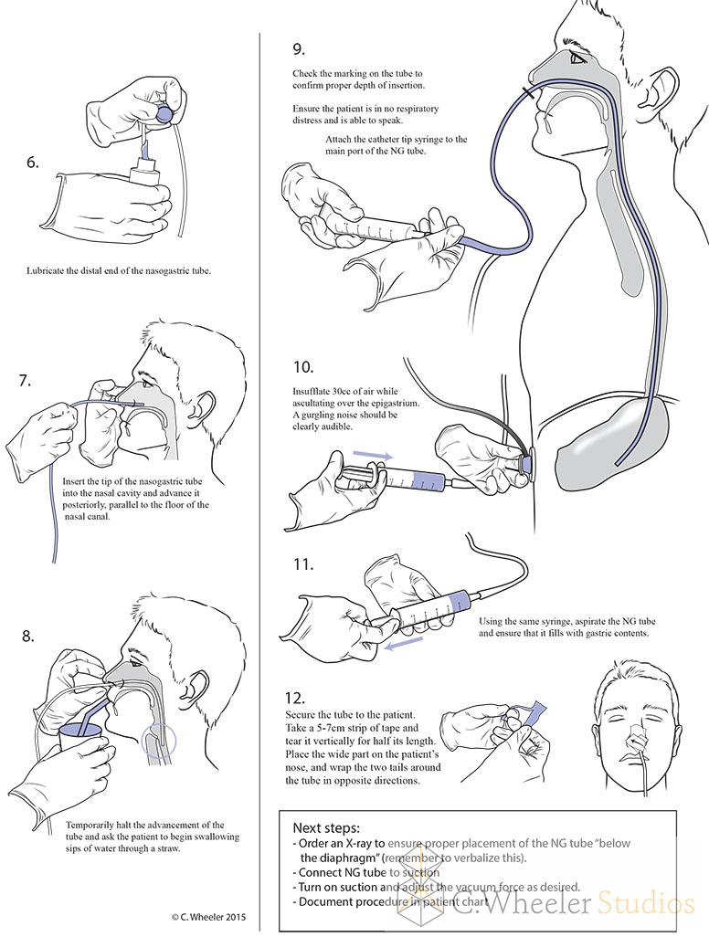
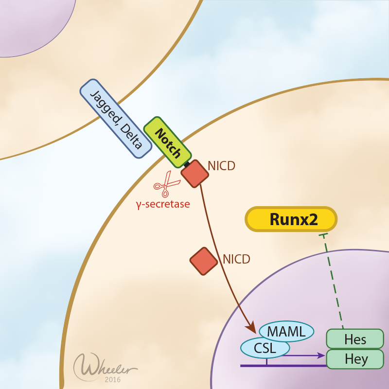
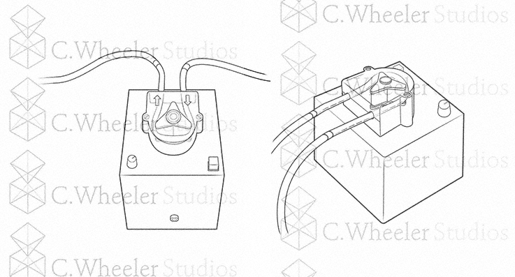
Vector illustration is probably the simplest, visually. It usually features simple outlines and shapes. It can be in color or not, and personally when using color I like to add a bit of texture as well. However, the real strength of vector illustration is that it is easily resizeable, and a good vector illustration can usually be modified to be a clear black and white illustration (let me know if this is something you would want, such as if you are making handouts). Vector is usually the fastest and cheapest as far as style goes--but it takes a great deal of skill and artistic ability to make it beautiful.
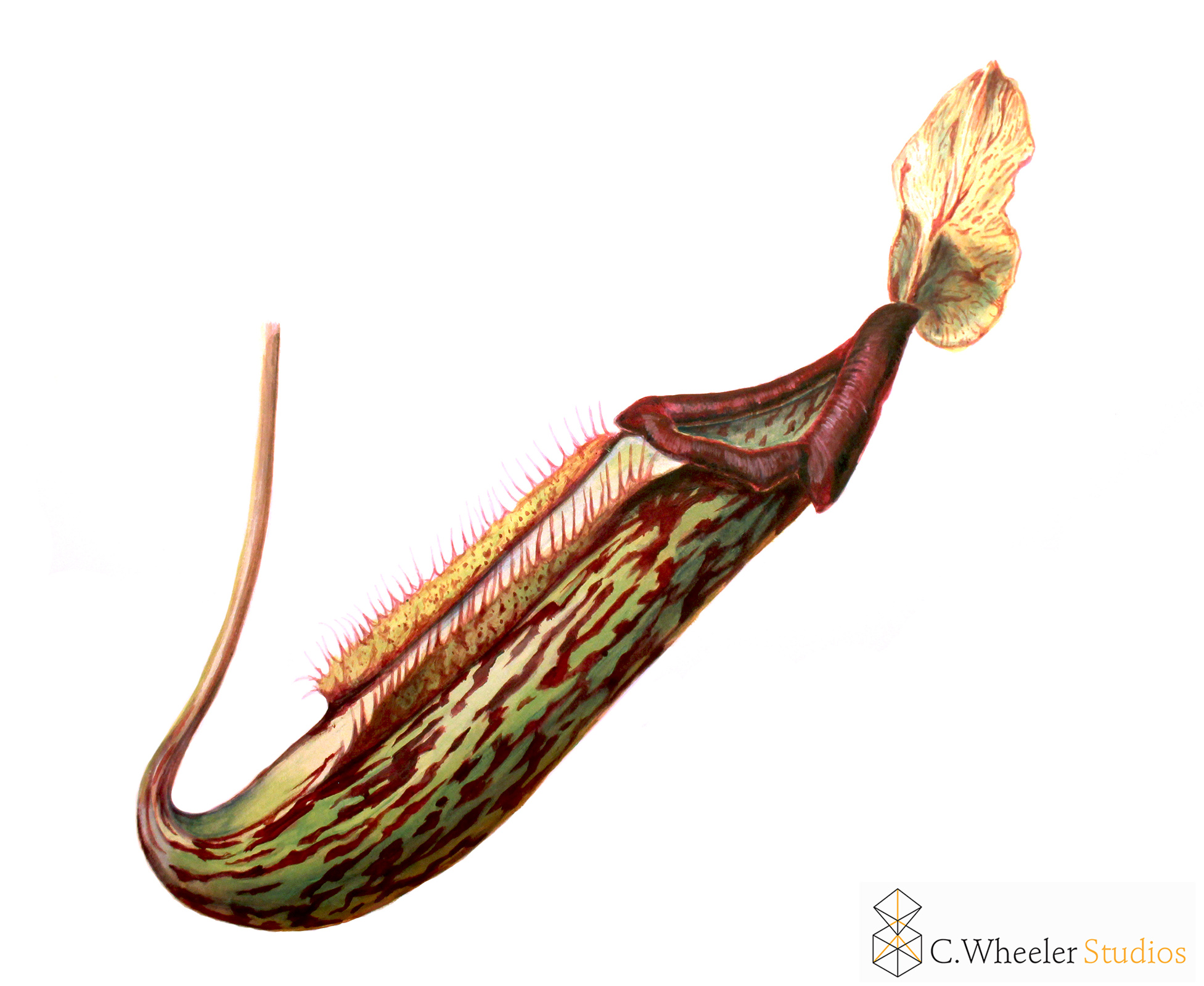
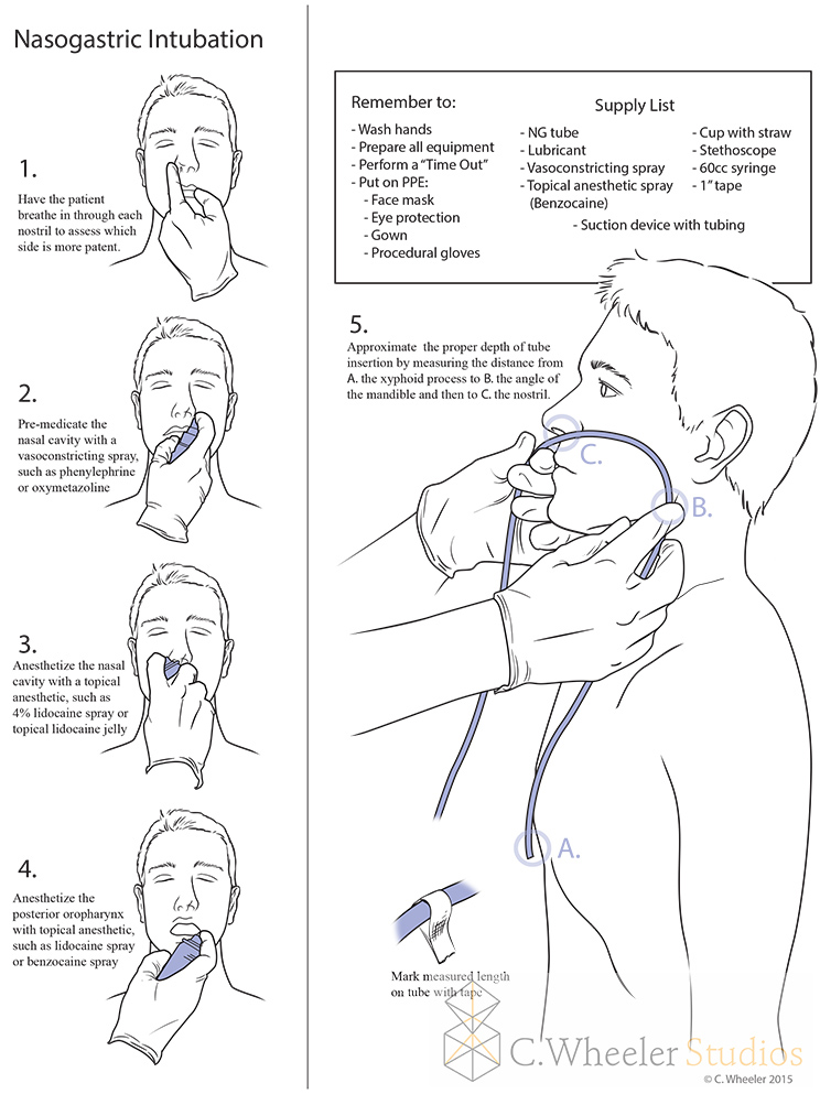
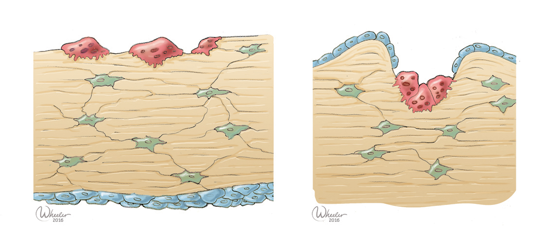
I often use this technique in conjunction with vector illustration, but this is a step more detailed. In this case, I use either digitally or hand-drawn outlines--similar to the black outlines around cartoons, and "paint" within them. The outlines give it a very illustrative look and provide clarity, as well as making my job faster--not worrying about making edges perfect while painting speeds things up quite a bit. However, I incorporate texture and detail that would not be found in a vector illustration. This is a style commonly employed by medical illustrators, and one I particularly favor as it is a great combination of clarity and aesthetics. However, I do not consider this "realistic" because things don't have dark outlines in real life!
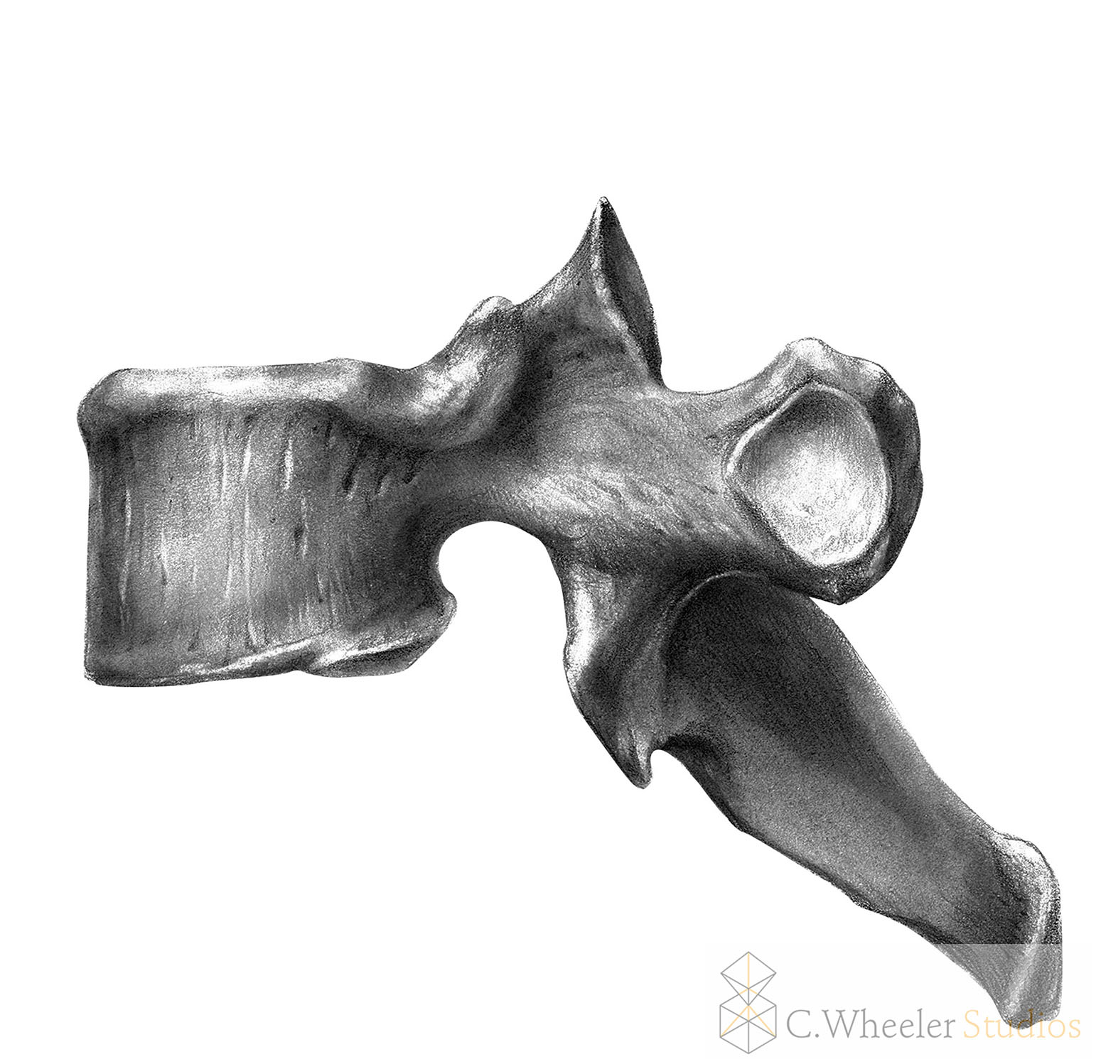
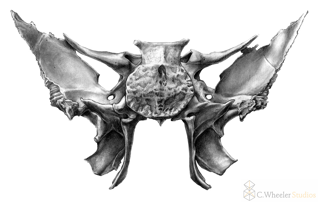
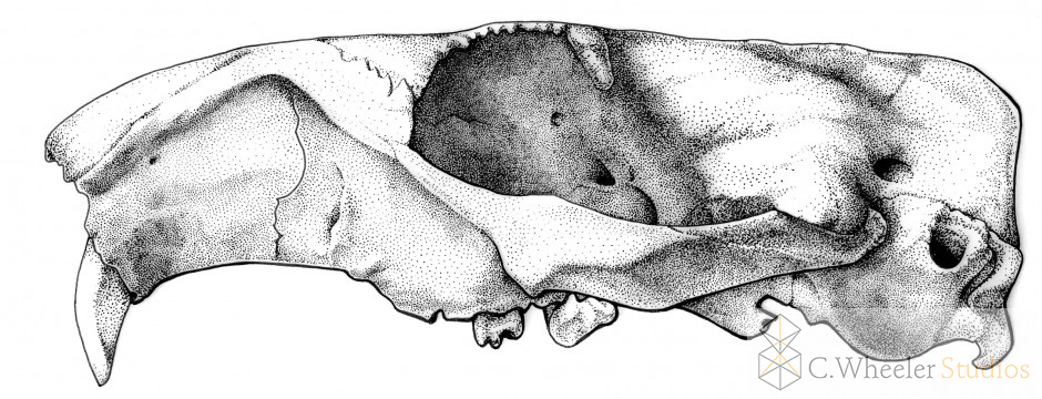
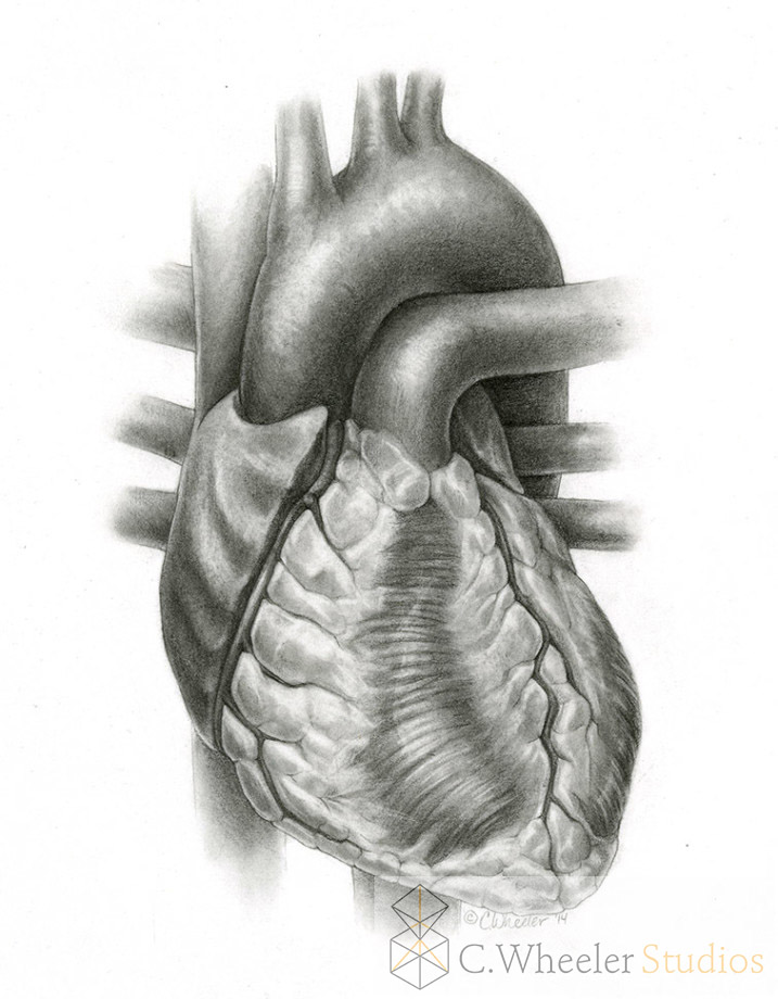
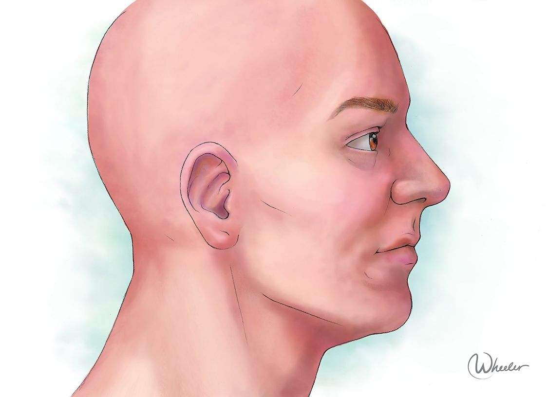
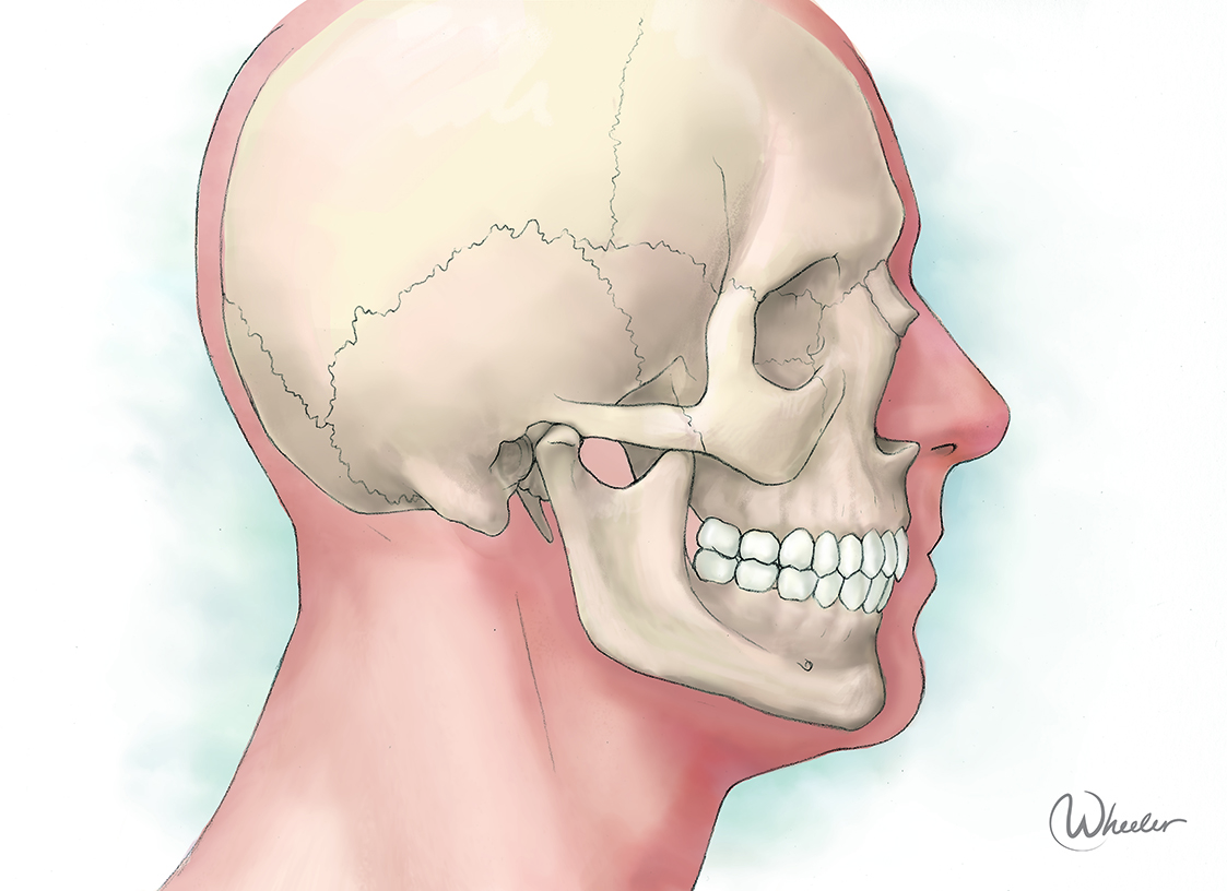
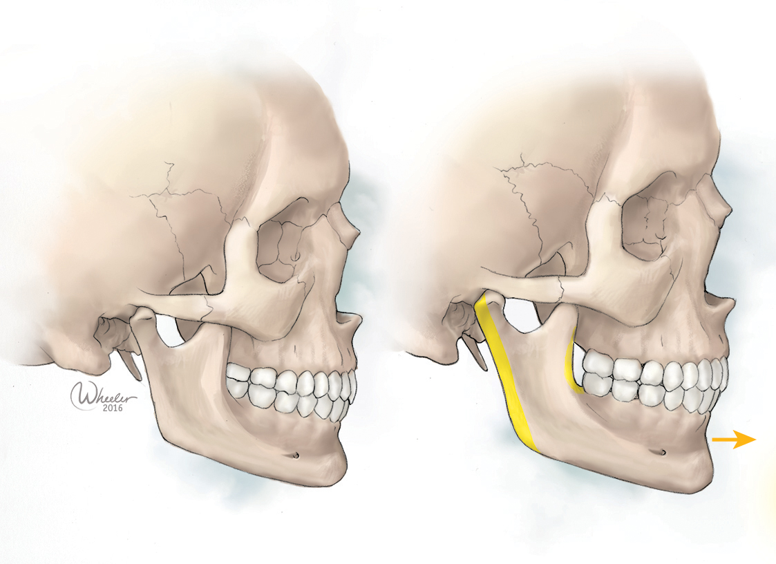
This style employs no outlines, the forms are created by the careful use of light, dark, and color. This is much trickier and more time consuming to do, however the results are beautiful. This usually requires full use of artistic skills, showing three-dimensional form and texture.
Color In Style
The other consideration is the use of color. Realism and color are not two separate categories, instead they are combined to determine the final style of the illustration. Incorporating color is more time-consuming because it requires educated choices on the part of the illustrator as a communicator, and aesthetic choices as an artist.
Black and white is exactly what it sounds like: no color, not even gray. This can be used for simple shapes easily, but it requires some problem solving to communicate 3-dimensional form and space--again, training and experience is required to pull this off well. However, in terms of color options, this and cel shading are the cheapest, because working with color adds complexity for the illustrator.
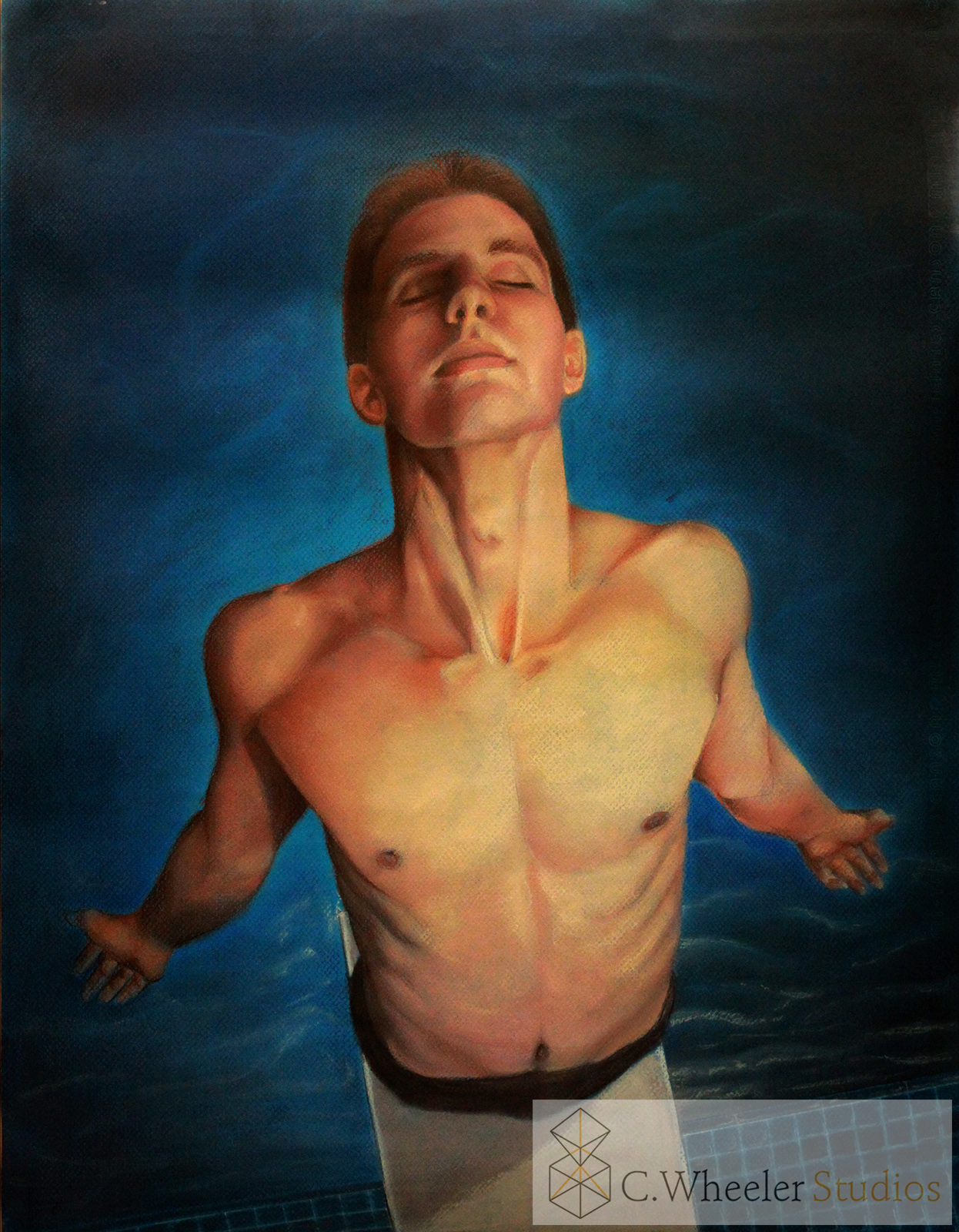
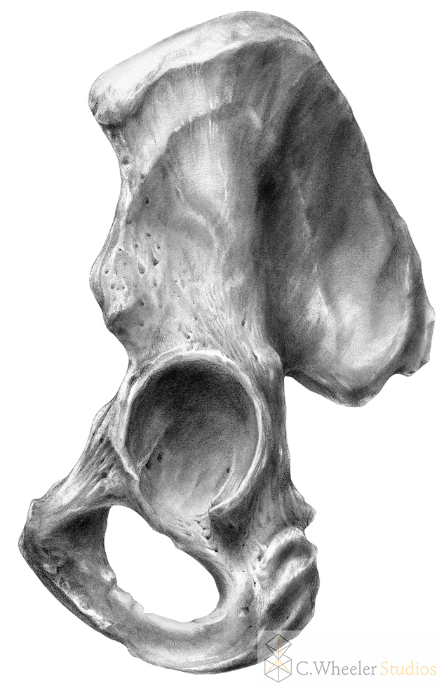
Also known as value, or continuous tone, this uses darks and lights to show 3D form. It is beautiful and elegant, and evokes the antique medical illustrations that we so love. Tone can be accomplished in a different color, such as dark blue, but it is monochrome--one color only
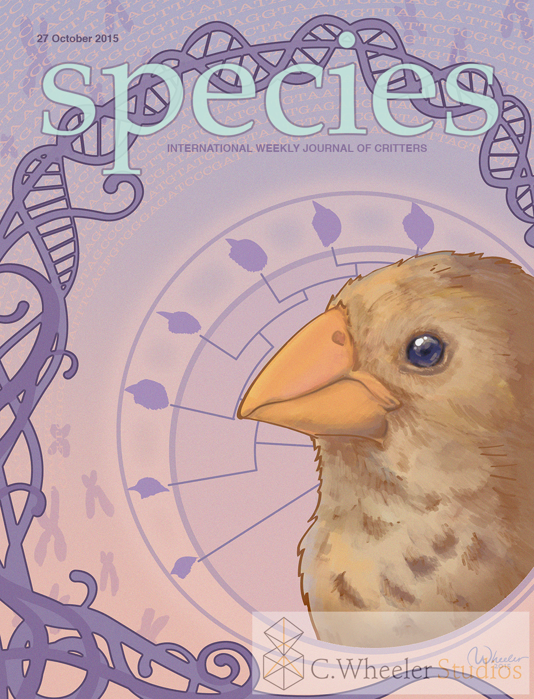
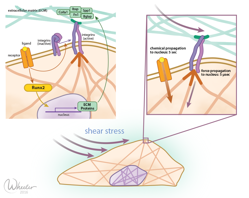
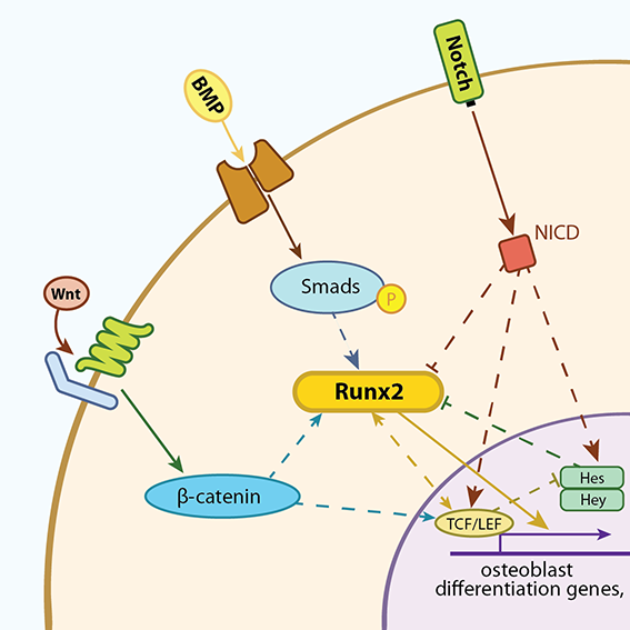
Cel shading means a more or less flat color filling in an outline. As some examples show, I add a bit of texture just to add interest at times, but it's not making the shapes three-dimensional and is entirely optional. This style can involve as much or as little color (such as using one "spot color" on a mostly black and white and gray illustration), but what is important is that there isn't shading--it's flat and cartoon-like.
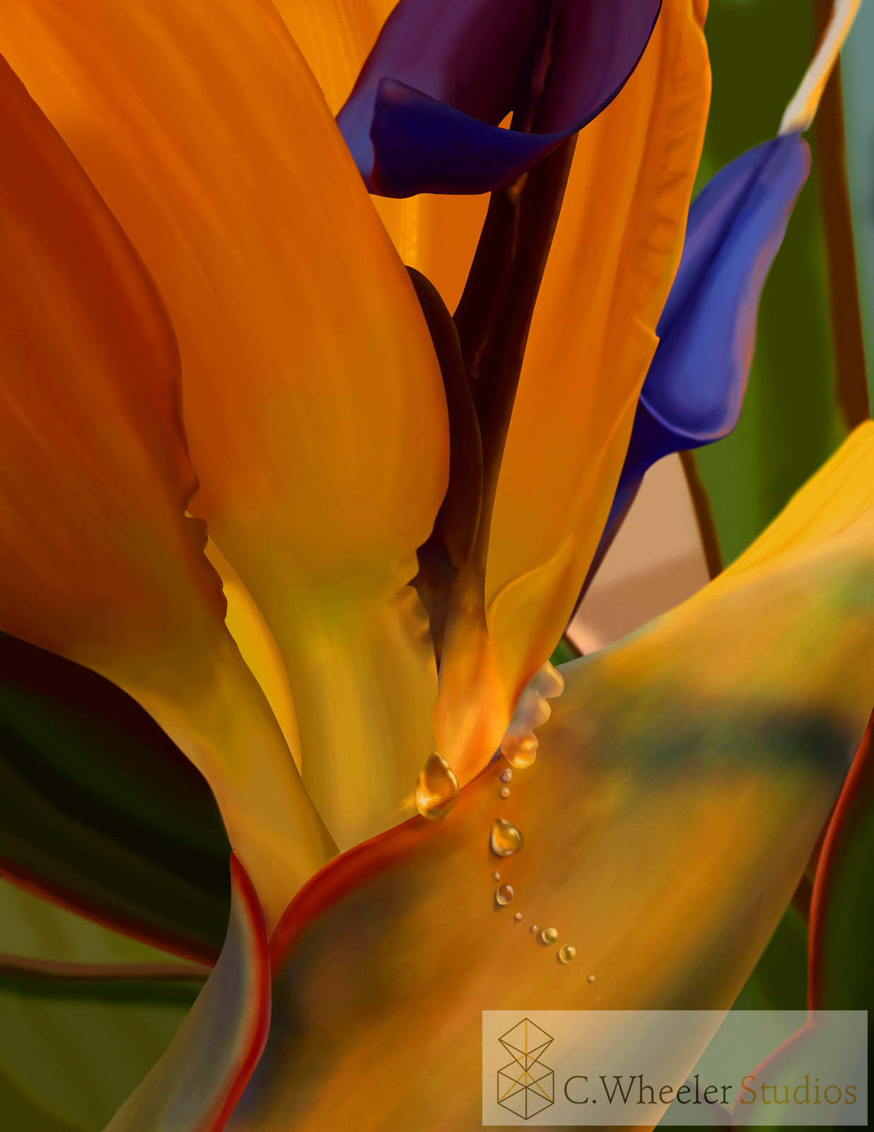
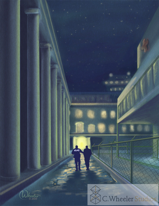
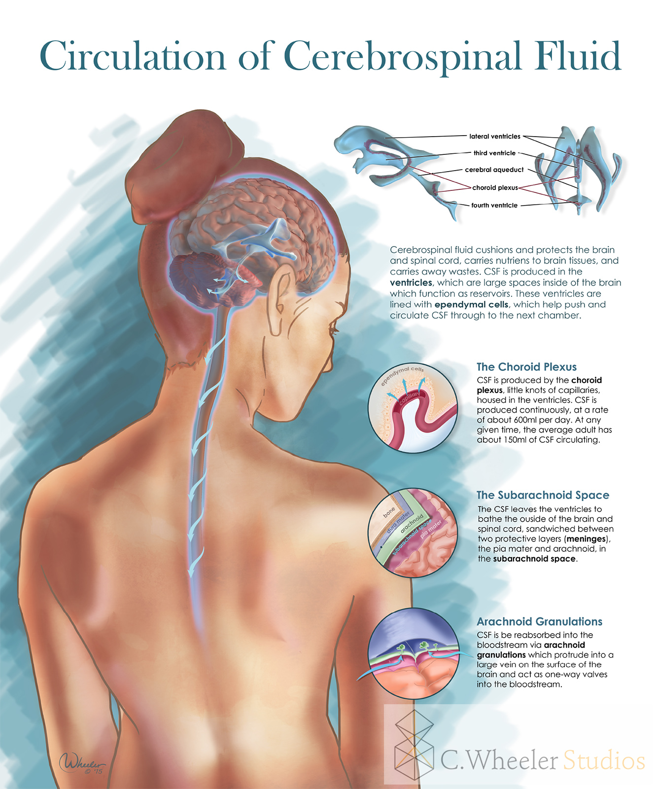
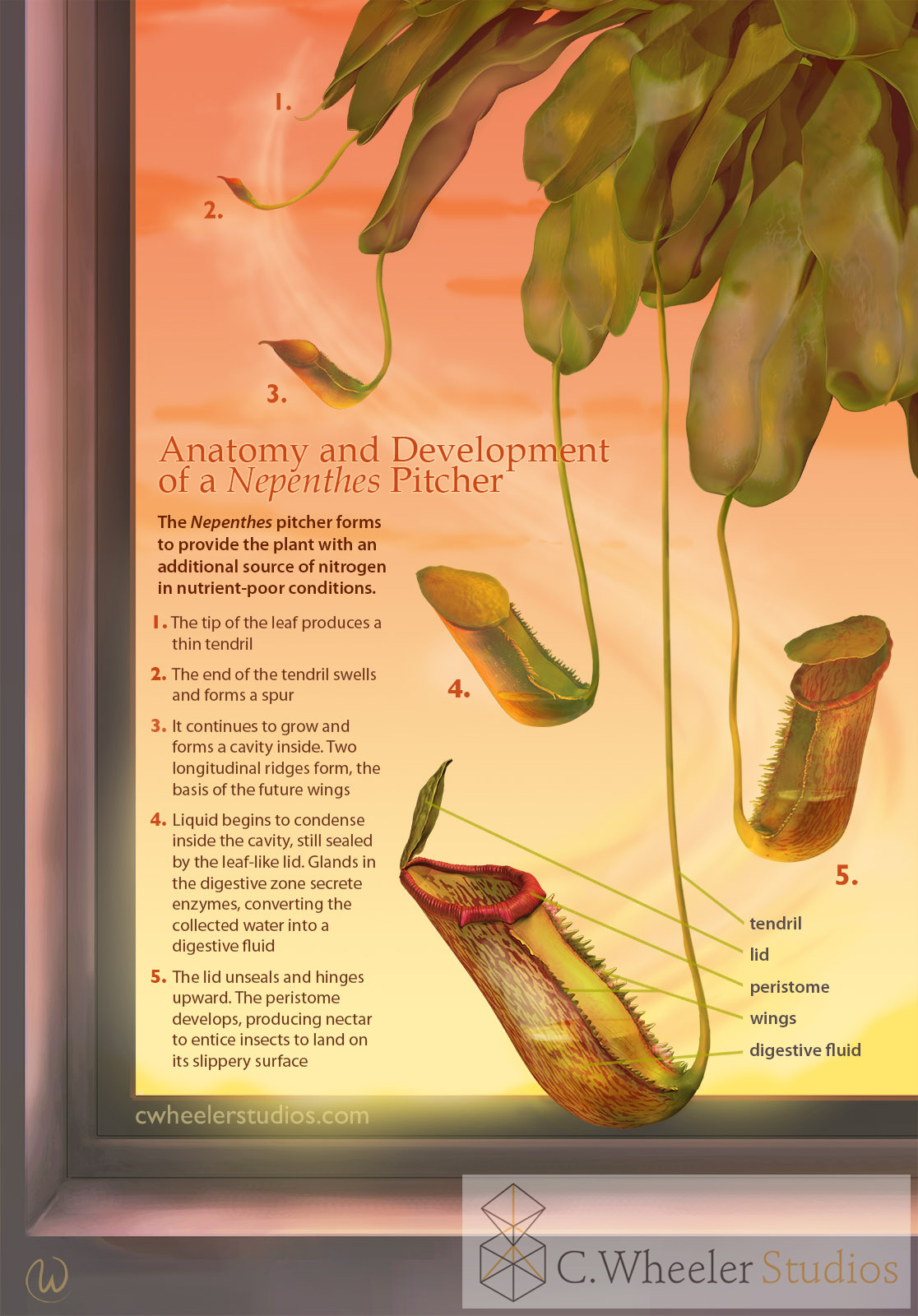
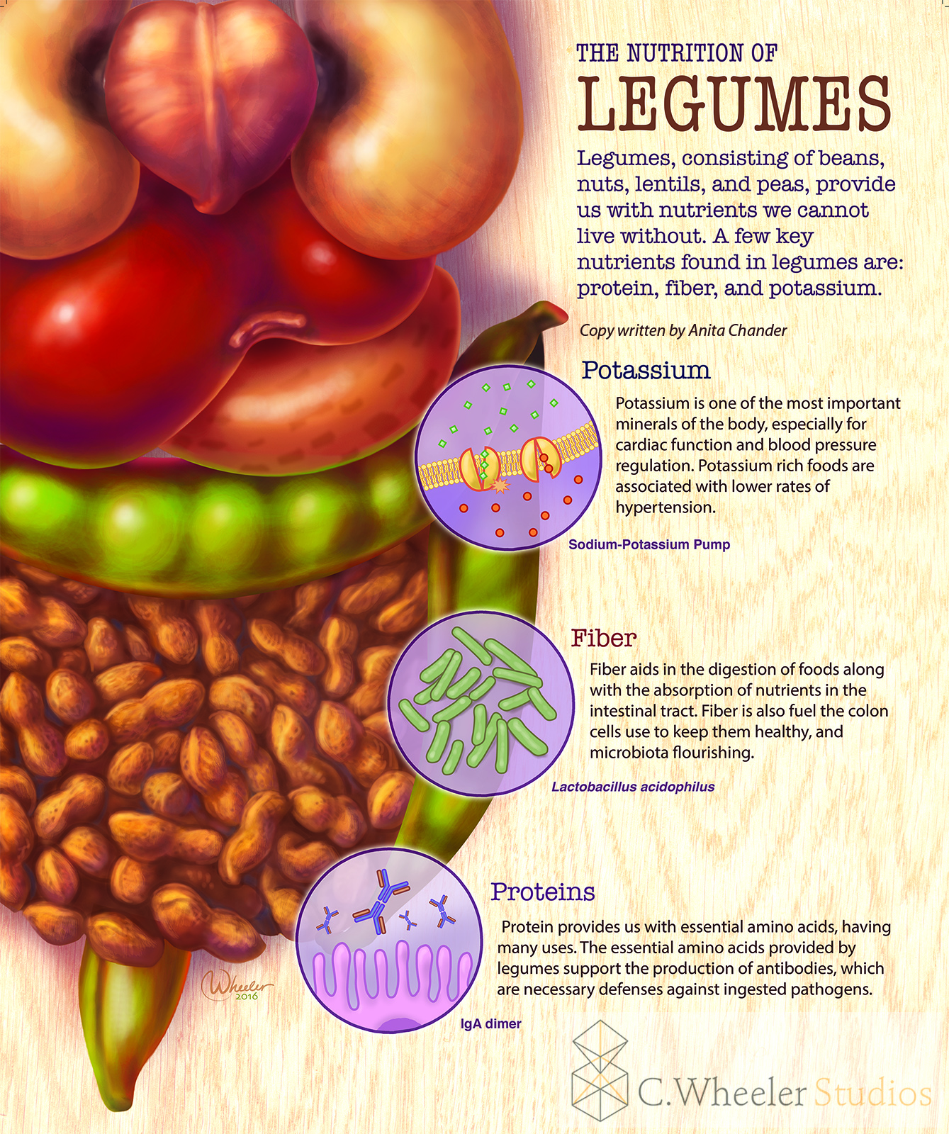
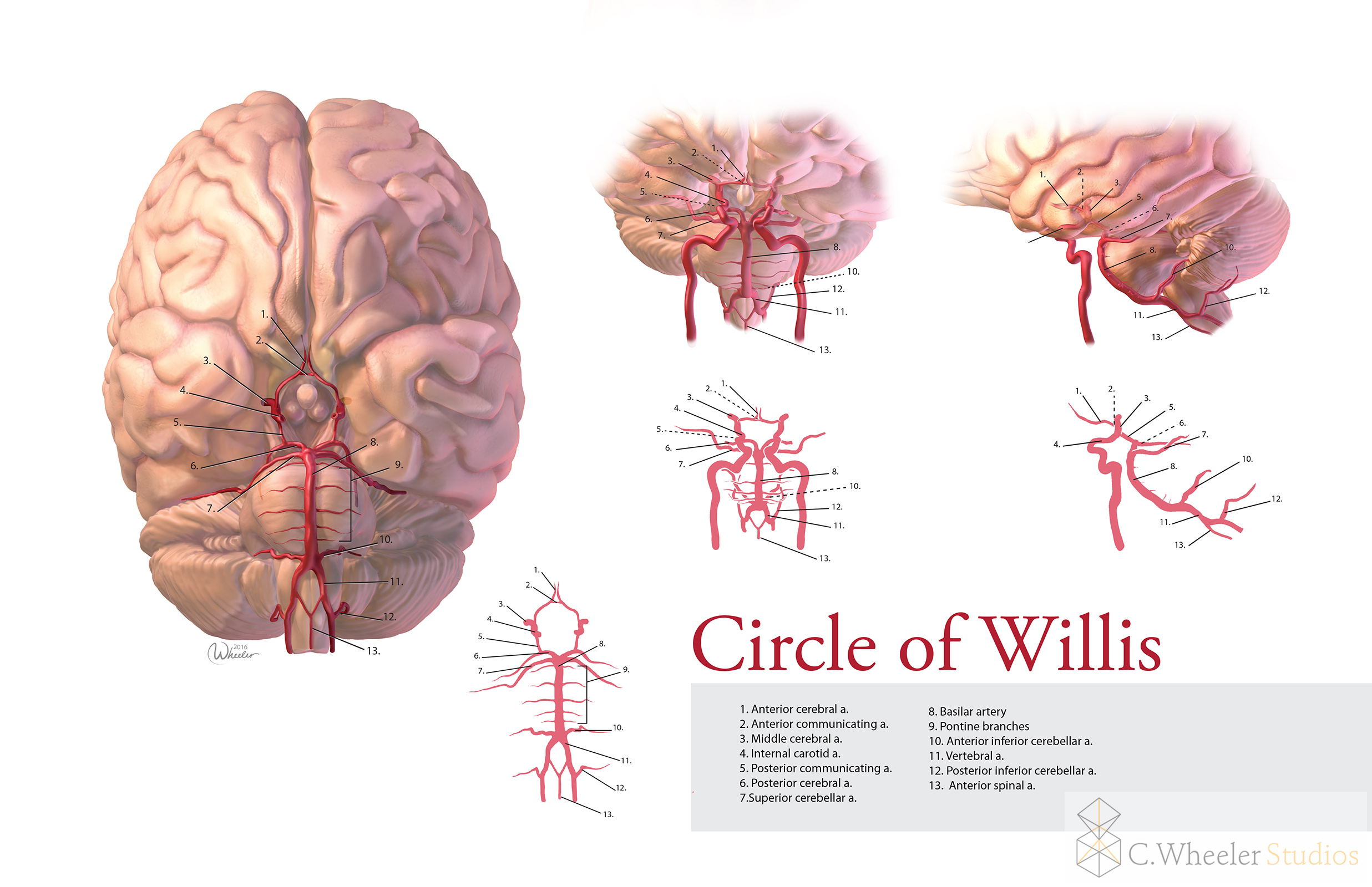
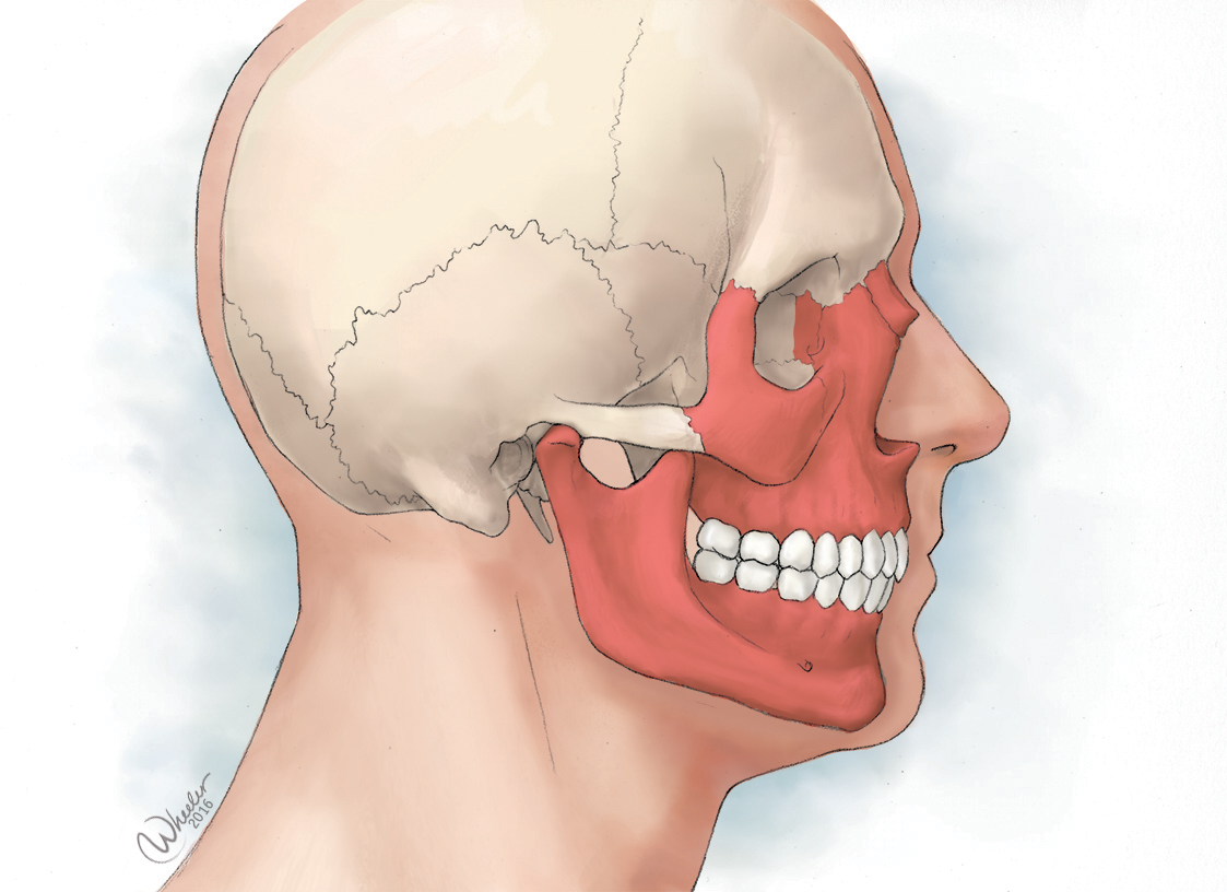
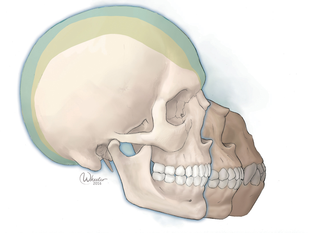
While some of the cel shaded examples are technically full color (everything is in color, except perhaps the background), I want to highlight this style as the most complex use of color in my work. I have to use everything I know about color and tone to create fully painted, three-dimensional forms. This can be accomplished with digital or traditional painting, or in some cases I employ 3D models that I have digitally sculpted, and paint and light them and incorporate them into a piece (I reserve that technique for very complex forms or ones that I have to show from many different angles, otherwise the technique is no longer efficient.)
In conclusion:
I tried to elucidate some of the considerations when I'm pricing an illustration or project--much of it comes down to how much time it will take, and the complexity of the illustration (I also take into account the distribution and usage rights, timeline, the amount of research required on my part, and so on, of course.) However, I hope this piece has clarified why I ask these questions at the outset, and that it helps you decide what sort of illustration you would like to commission.Also, the simplest way to communicate to me what sort of style you would like is to select an image in my portfolio that matches the style you like, with any differences you may want--I know there's a lot of information here with some fine distinctions.If you have any questions, please do not hesitate to contact me.
I also hope that it has given you a new appreciation for the sort of work and skill that goes into creating illustrations that are effective as well as beautiful! I hope to do more of these posts in the future, clarifying aspects of my process and some of the types of medical and scientific illustration. Let me know your thoughts, and if there's a specific topic you'd like me to write on!

